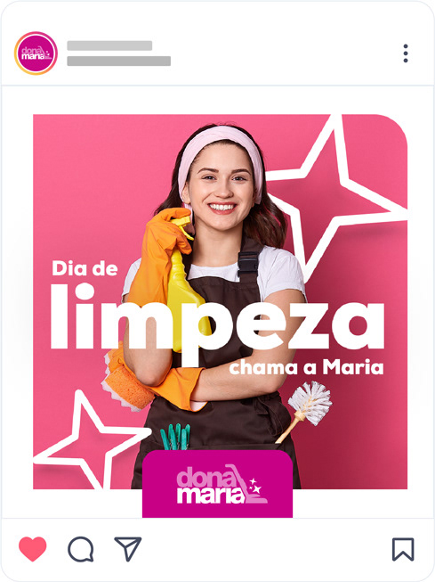
Dona Maria is a company that offers cleaning services for homes, businesses and post-work. The client needed a visual identity for their social networks.
In this project, developed by WI advertising agency, I developed a very dynamic identity, creating each step, the idealization, the designs, the animations and even the texts.
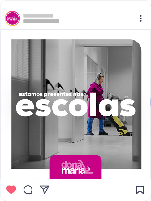
I thought of diversifying up to four types of posts so that the page content wouldn't be so repetitive.
FIRST LAYOUT
The first concept would be the "before and after" concept. Before, when everything was dirty, and after, when we hired Dona Maria.

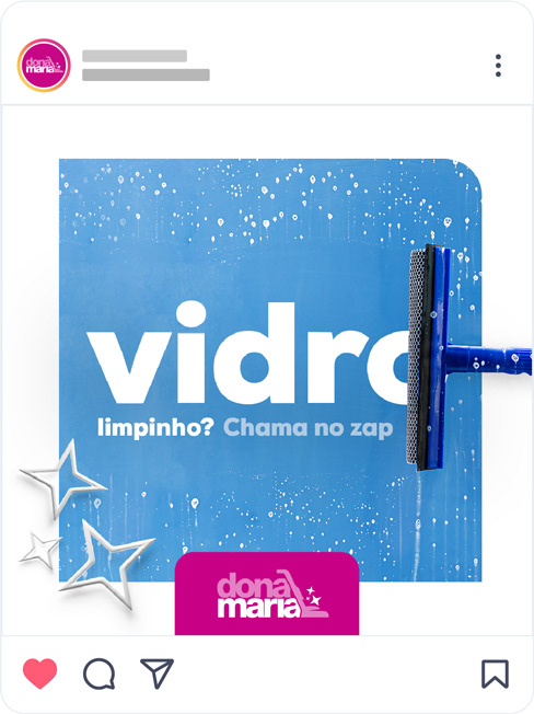
SECOND LAYOUT
The second type of layout would be colorful and vibrant, with eye-catching text and using the "sparkles" of the logo as elements of visual identity.

THIRD LAYOUT
The third type of layout would be videos. In this one I worked with an interactive transition, between the message and the video.
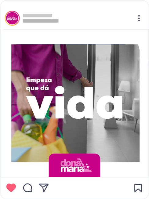
FOURTH LAYOUT
The fourth type of layout would use the concept that Dona Maria brings the room to life, an idea conveyed by the colors.

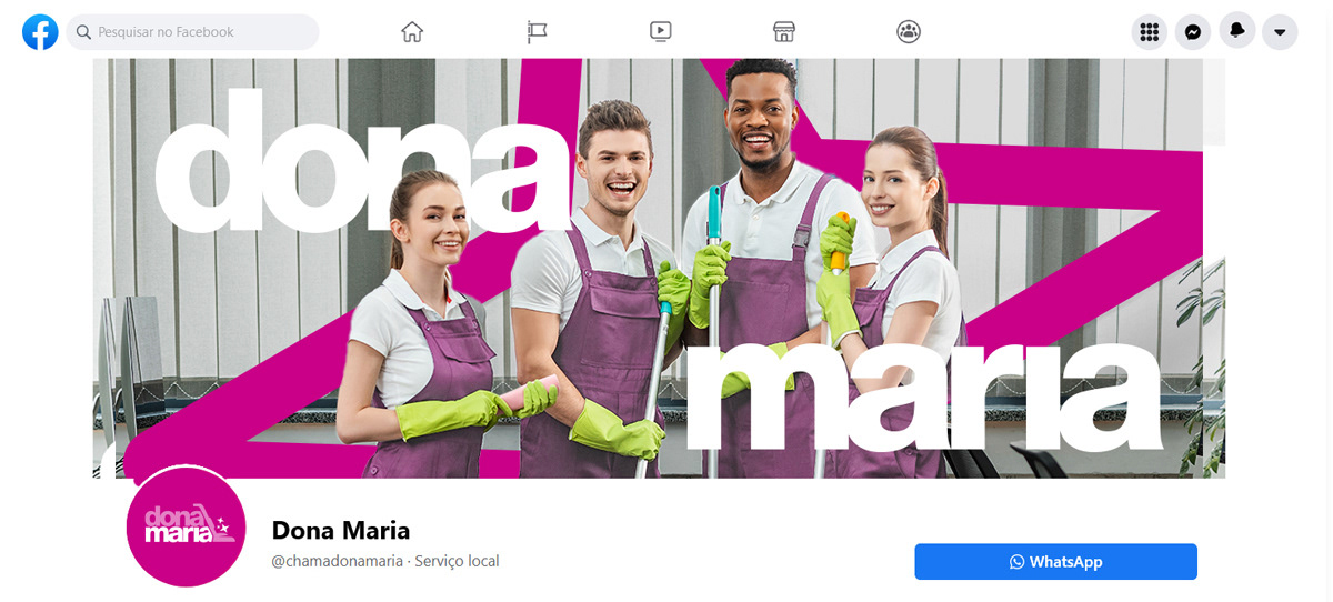
I also created other pieces following the visual identity, such as the facebook cover.