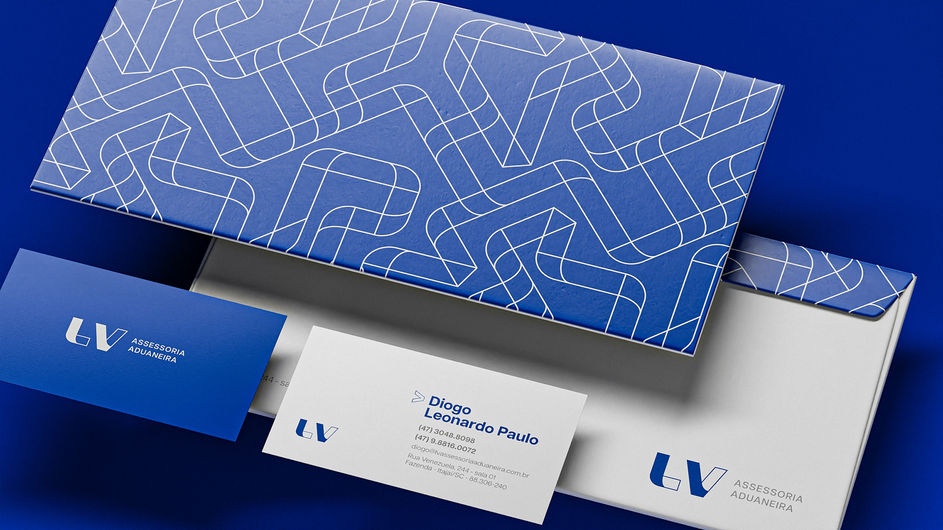
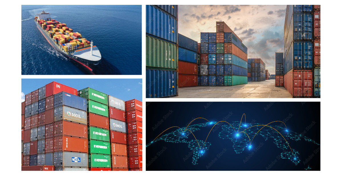
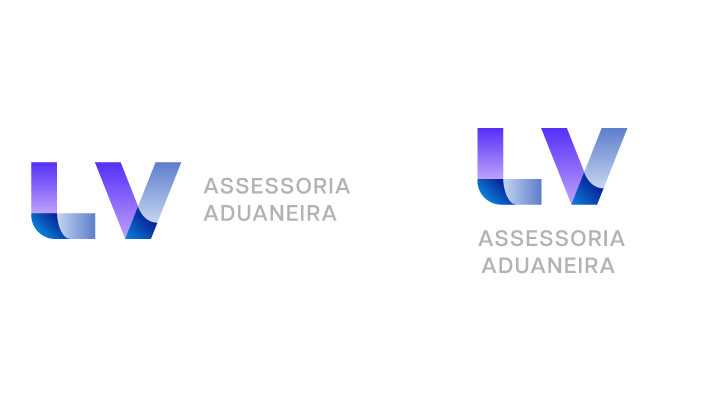
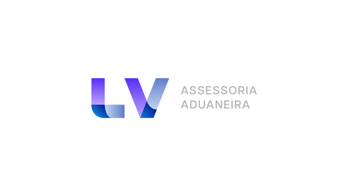
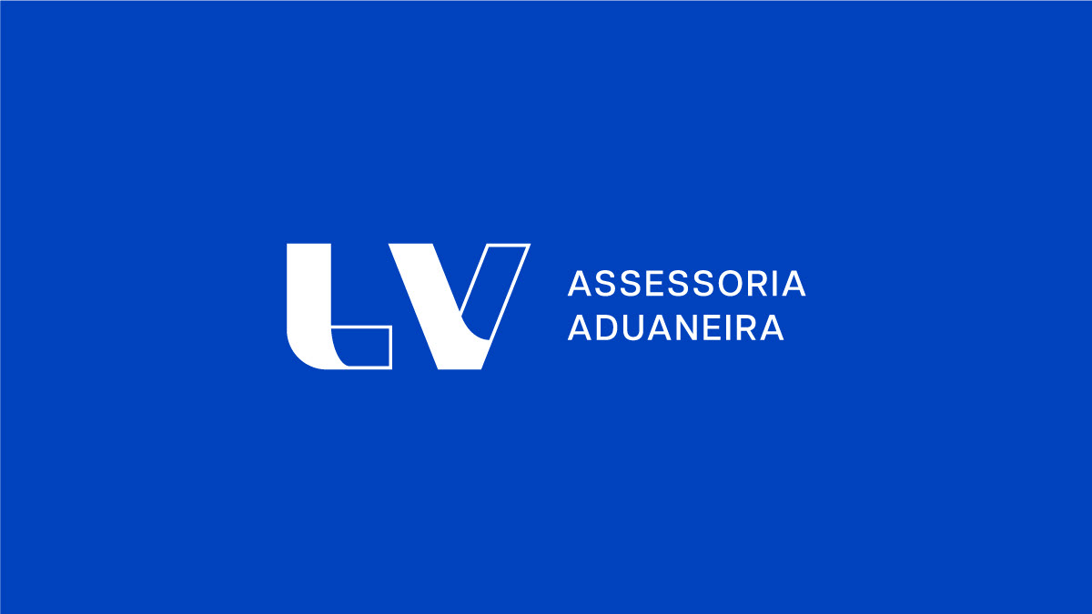
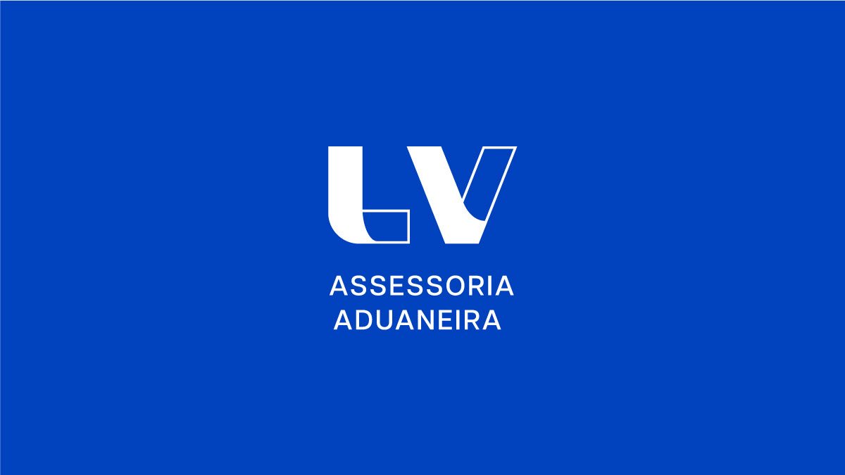
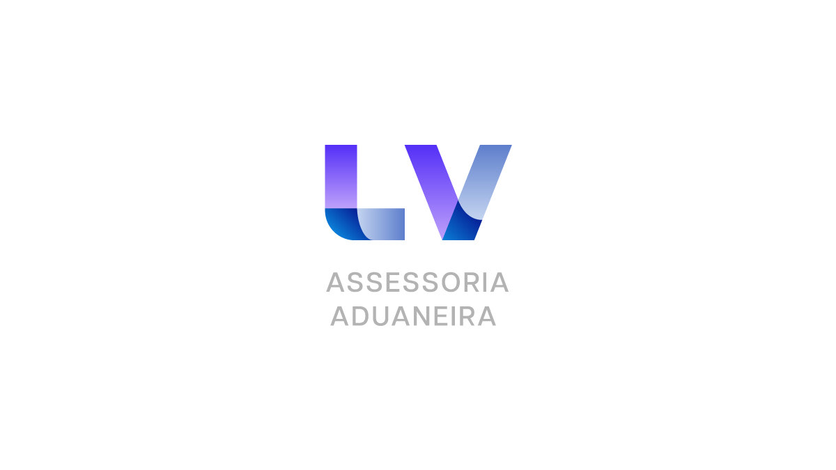
LV assessoria aduaneira is a maritime forwarding company that offers logistics solutions for its clients, importers.
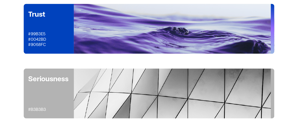
The client was looking for a visual identity that would transmit modernity, seriousness, trust, and that would be geometric. The identity should use the colors blue and gray and should be a typography-based logo.
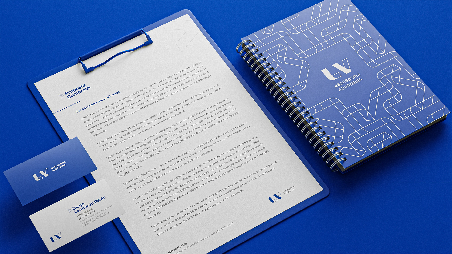
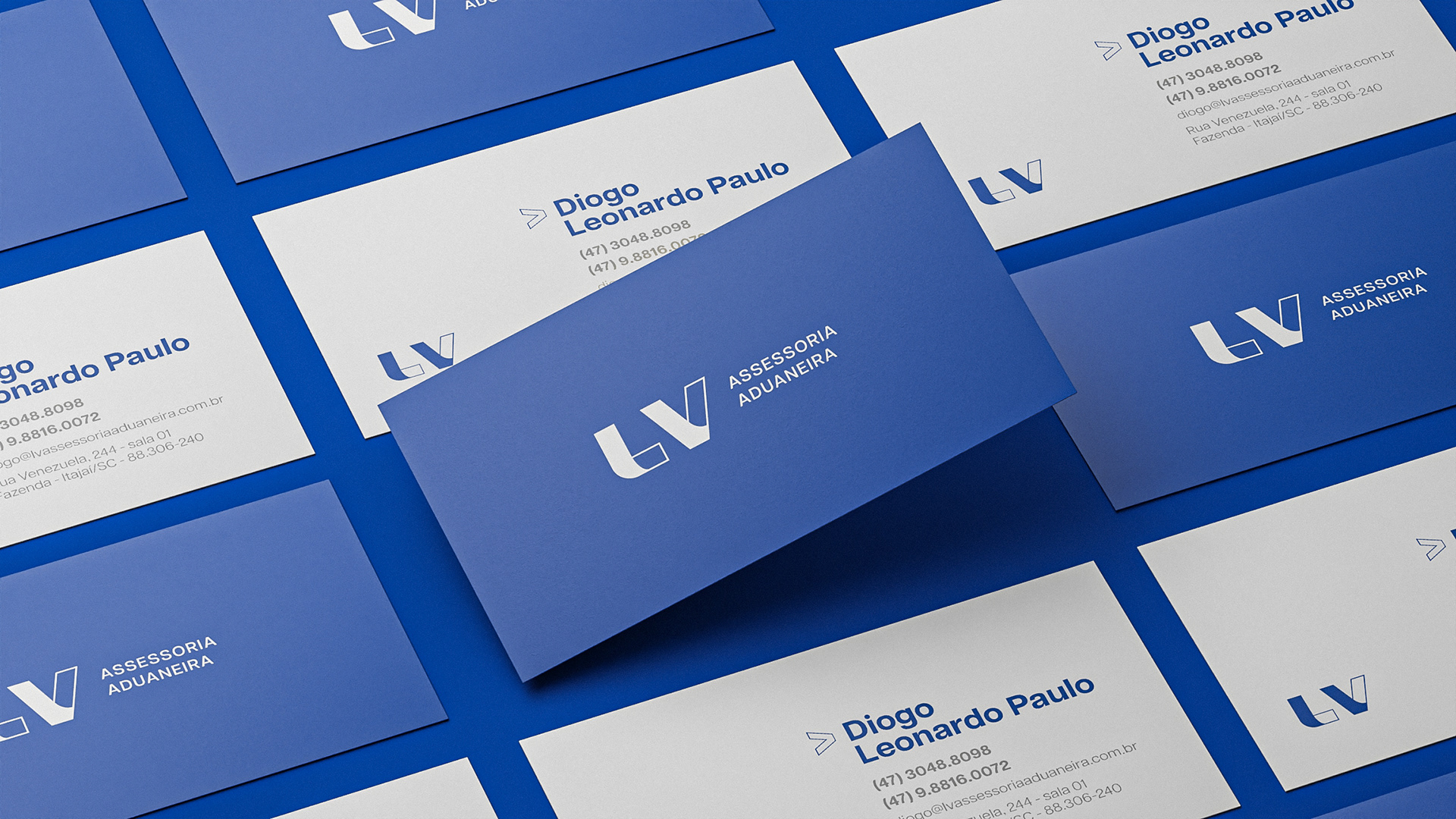
Besides the visual identity, I created the 3d mockups with Blender.
INSPIRATION
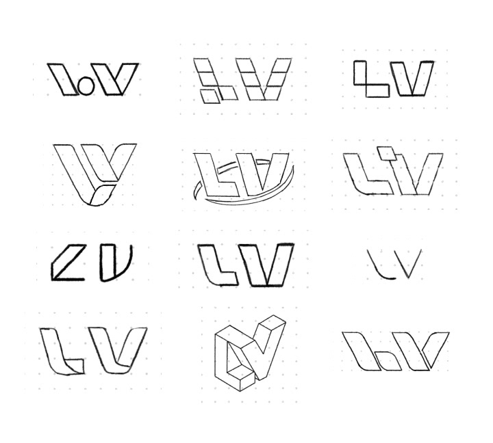
CREATIVE PROCESS
The client wanted a lettermark type logo using the letters LV. The logo should be geometric, serious and modern.
Being a lettermark I couldn't use such abstract silhouettes as they would make the logo hard to read. So I developed a logo with a good silhouette and tried to work with the style.
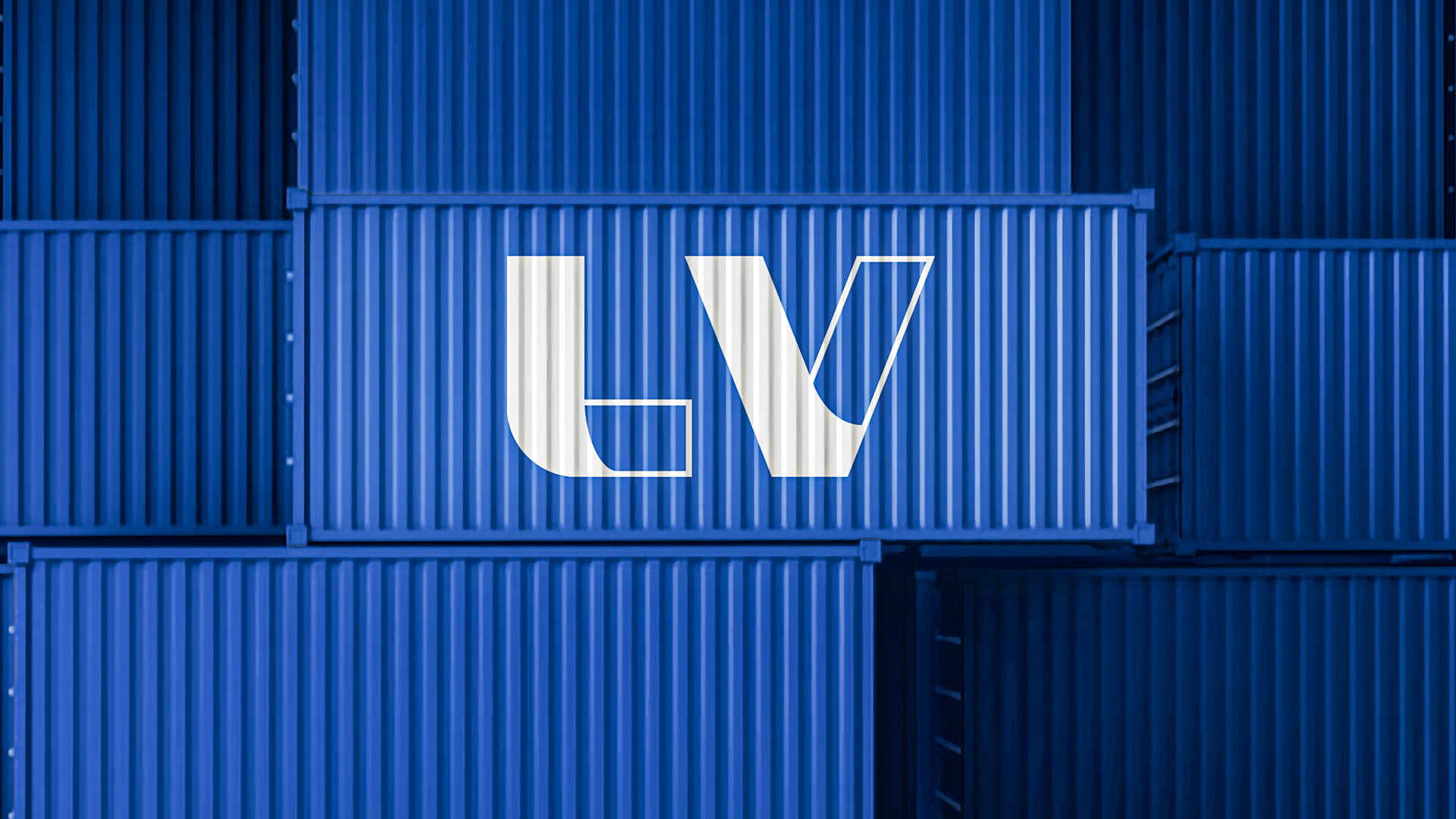
ICON
I tried to make the LV very readable. The letters convey the concept of a path. The blue also brings the idea of sky or ocean.
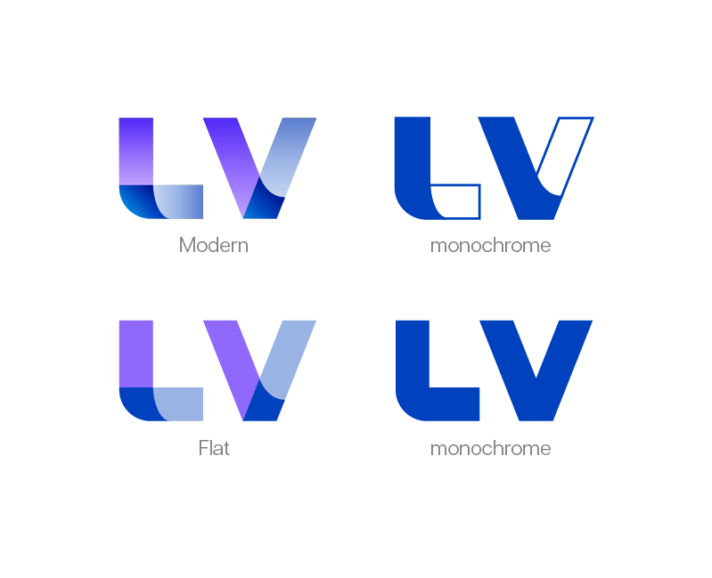
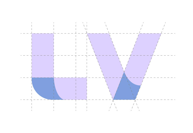
The shape of the letters are unique, made from scratch.
I created the letters with overlapping parts (the darker parts) and made the logo based on a more square grid inspired by how containers are stacked.
LV Assessoria is a responsive brand.

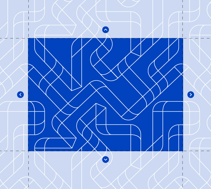
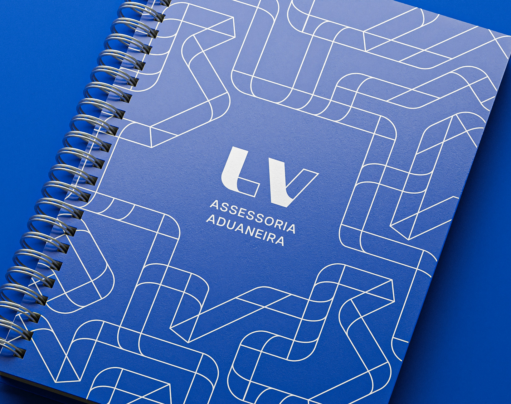
PATTERN
Inspired by letters and the concept of paths.
To increase the area, simply duplicate the pattern.